Pops of Pink
Blush, flamingo, Barbie, magenta. Rose, millenial, salmon, fuchsia.
There are countless shades of pink to choose from, and, truth be told, I am a fan of practically all of them.
There is something both strong and whimsical about a beautiful shade of pink, and the variations in tonality ultimately make pink a very versatile color that can be used as either a central shade or a highlight in design, decor, fashion, you name it.
Pink is also a very evocative color. Perhaps that dusty shade of mauve reminds you of your very first pair of ballet slippers from when you were a four year old plieing across the stage at a dance recital. Maybe that gorgeous shade of rose brings to mind the bouquet you carried on your wedding day, while that bold, blue-leaning magenta is reminiscent of the lipstick you were wearing on the night you met your future husband at that little bar in the East Village.
The color pink, paradoxically, feels very nostalgic while also appearing fresh and modern. It is a true chameleon color that can adapt to different spaces and plays nice with many other shades on the color wheel. Tried, true, and here to stay, there is a reason that pink, in its many forms, has been a mainstay in design for decades.
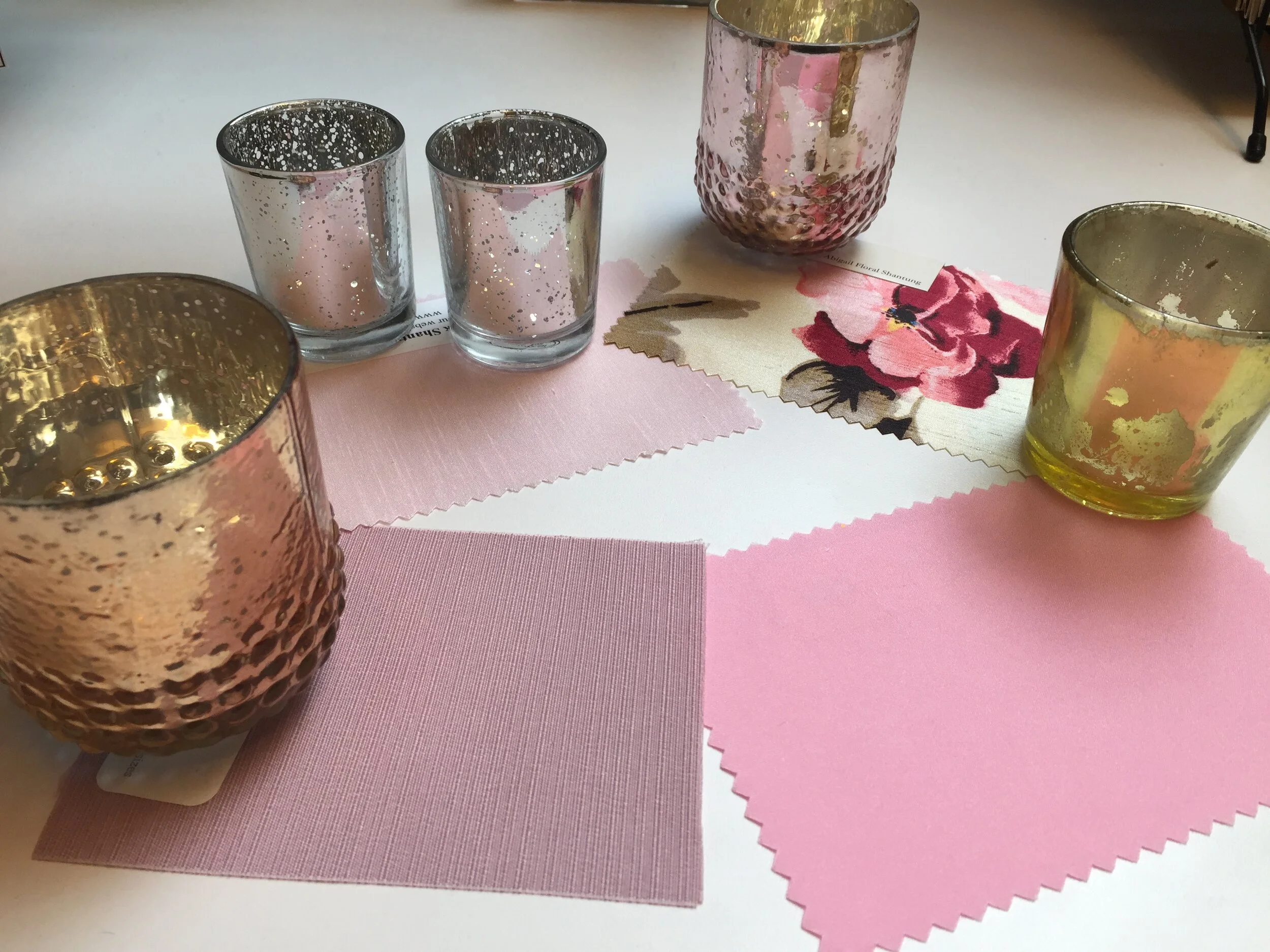
While I am happy to tout the positives of pink in all of it’s iterations, and will be revisiting it many times on this site, today I’d like to feature a personal favorite shade of mine. Warmer than blush and not-quite mauve or champagne, this sophisticated color is a light pink infused with a healthy dose of sandy beige, creating a tone that is complex and distinctly modern.
This dusty shade is interesting enough to stand on its own as a focal color in any room in your home, but it is also versatile enough to be treated as a neutral. This color is a great option for those of us who are getting tired of seeing every room painted and decorated in shades of white and grey (ahem, “modern farmhouse”). Urban or rural, apartment, cottage, colonial, and everything in between- try it out in your own space. I bet your boyfriend or husband will like it too!
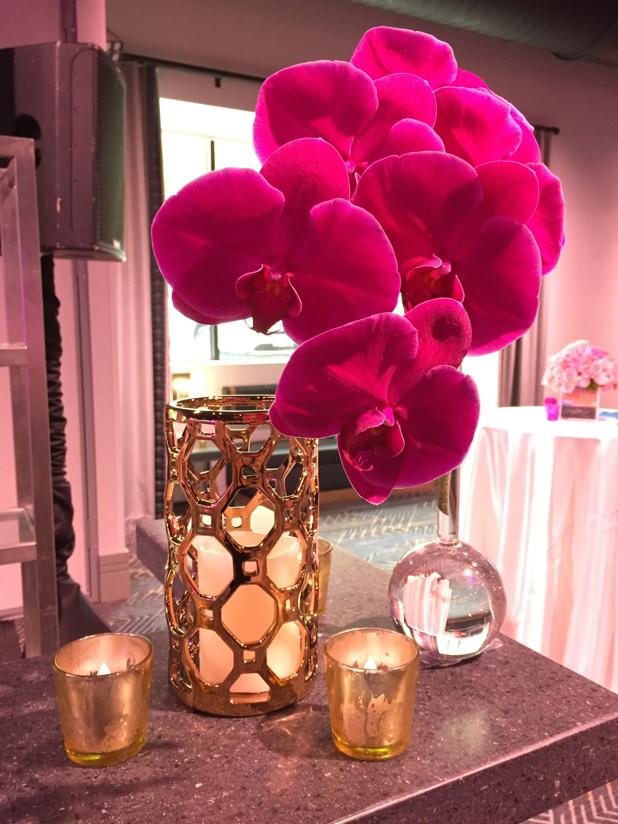
Designer pro tip- if you’d like to go all-in on this color scheme, try infusing your decor with pops of rose gold in the form of smaller objects and elements such as hurricanes, mirrors, or flatware. This metallic accent will provide visual interest, while the rose tone will compliment your dusty pink focal color. Don’t be afraid to layer on slightly different tones of the same shade- life, and design, are about variety, right?
When thinking about how to tie together your space, consider what other colors compliment dusty pink. Do you have any initial instinctual ideas? My personal favorite options are a rich shade of burgundy or a gorgeous, creamy olive. Both of these colors will be sure to infuse a richness into your home, and will balance out the more muted, subtle sandy pink. Instantly, you will have a polished color scheme that is modern, fun, and unique!
Clockwise from top left: Calamine, Pink Ground, Studio Green & Brinjal. All Farrow & Ball.


